Record cover design as a branch of taxidermy? It sounds like a cue for jokes about stuffed pop stars, but for our purposes, looking at sound and vision, the analogy seems apt.
Successfully transforming a musical event onto record requires that the eventual listener be willingly duped. What is heard may seem lifelike but it isn’t real. It’s sort of realesque; an aural conceit aiming to preserve the moment of performance in the same way the upholstered sabre-tooth tiger gets posed, mid-leap, against the fake permafrost of his museum case.
The record cover is a kind of skin and that’s where our eyes are first tricked. In the configuration of image and text the designer/taxidermist attempts to reinvigorate something of the original event. If it’s done well there’s the promise of visceral excitement, maybe even musical catharsis, but all too often cobbled-together expedience delivers only a post-hype “meh” and a pocketful of sawdust. Sometimes the cliché holds true: you really had to be there.
But the graphic specimens below – caught and posed in this virtual vinyl museum – still flicker with energy and, if you squint hard enough through the dust of their 12” x 12” enclosures, it’s almost like their fires still burn.
A Nite at the “Hi Diddle Griddle” – the Paul Lestre Group (Stebbing, 1959)
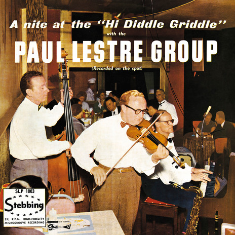
Paul Lestre was a London émigré playing polite, bebop inflected jazz to adventurous Auckland diners. In the late 1950s his group scored a residency at the – both corny and cool sounding – Hi Diddle Griddle at 507 Karangahape Rd. The Griddle, owned by Jim Jennings, who many thought was an American, was set up as an authentic stateside steak house, equipped with charcoal broiler, pizza oven, the whole works.
The 1959 Griddle menu – reproduced in Perrin Rowland’s excellent 2010 book Dining Out: a History of the Restaurant in New Zealand – is a drool-worthy read stuffed with classic T-Bone steaks (“Mighty Jumbo – 11/6”), Chicken Cacciatora (“sautéed in sherry wine – 15/6”) and gut-busting three-decker sandwiches worthy of any New York deli (“The Dagwood – lettuce, bacon, tomato, ham, cheese – 4/6”).
Sadly the menu comes without illustrations and there’s no plated food visible on the cover of the LP, but it’s remarkable they had room to serve gut-busting triple-decker “Dagwoods” so poky does the Griddle look here. Way out at the back of the shot, slinging hash, stands the chef in his kitchen whites and in the middle distance is a formerly attired waiter addressing the camera with a particularly saucy stare.
Lestre himself – baring an uncanny likeness to Peter Sellers’ Dr Strangelove – saws away on the fiddle, but his natty bow tie and flannels, belted up around his armpits, root him firmly in jazzbo territory. Indeed, he and the other boys in the band wouldn’t have looked out of place up on the stand up at one of 52nd Street’s smoky jazz dives. His real name was Jim Callen.
There’s nothing fake about this cover, it’s the real deal, but from the post-modern vantage point, jaded and jaundiced as we increasingly are, the tableaux presented on A Nite at the Hi Diddle Griddle seems impossibly quaint. The bow ties; the white-coated waiter; men in suits and starched shirts; absolutely no one photographing their food! It’s a world long gone.
No 21st century hipster start-up could ever recreate a joint like this. The people pictured here, frozen in their dine and dance moment, were caught on a wave of mid-century Americana that had rolled all the way down to little ol’ New Zealand. The music, the food the movies – it was a benign Uncle Sam, spreading his cultural munificence. How times have changed. Right now, from this end of the telescope, a nite at K Road’s Hi Diddle Griddle back in 1959 looks like a triple-decker slice of heaven.
Oswald Cheesman Plays Latin and Bossa (Kiwi, 1966)
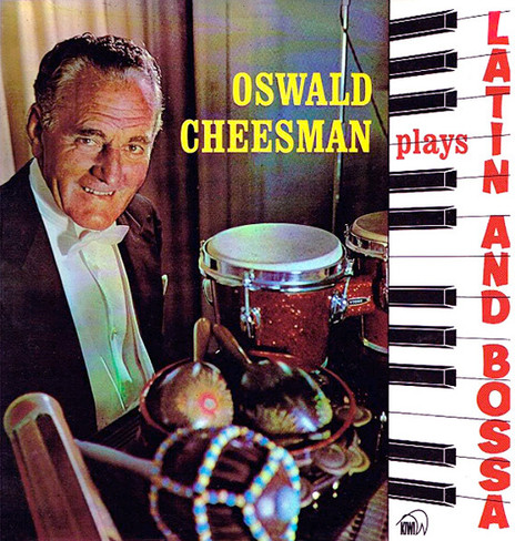
I’d like to think that Oswald Cheesman attended all of his recording sessions in white tie and tails. In fact I’d like to think he did everything in full DJ. Here he comes, resplendent in top hat and patent leather shoes, swishing into the butcher’s to pick up sausages and corned silverside … now he’s in the garden tying up his tomatoes. “Try not to get the French cuffs of that dress shirt dirty again, Oz,” harps Mrs Cheesman, “they’re a bugger to clean …”
Sadly the cover of Latin and Bossa is a confection. The fall of a curtain – easily mistaken as highbrow concert hall – is merely studio baffling, and OC’s DJ is window dressing, a formal affectation to “raise the tone”. But that’s okay because the design of the cover addresses a very specific audience and it does it effectively.
As presented here El Cheesman is ready for business – Latin business! Spread across the top of his Steinway is a percussive arsenal waiting to be shaken, stroked and gently beaten. The vertical keyboard and jaunty “Latin and Bossa” lettering brings to mind the kind of signage you might have found outside the doorway to a dance studio, above a furniture store in Petone, where Tuesday night tea dances gave the nimble toed a chance to work on their rumbas and cha-cha-cha’s.
Oswald’s people were dine & dance aficionados, lovers of “light music”. It’s a term more sympathetic than “easy listening” because within its literal definition – the inverse of heavy – lies the implication of the music’s lucent qualities. Recordings like this are too easily scorned as cheesy dreck but they do what they do just as “authentically” as anything in the rock sphere. Let’s face it, rock and roll is at the stage now where it’s far more contrived than the “pops, orch and light” stylings from the dapper Mr Cheesman’s era.
Definitely Pleazers – the Pleazers (Zodiac, 1966)
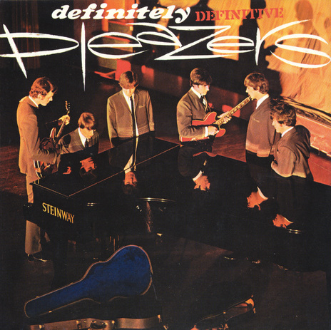
It’s like a well-tested chemical preparation – equal parts Chelsea Boot, Gibson guitar, sharp suit, floppy hair and sideburns. Throw in a willfully misspelled name, heat over a Bunsen burner and what you’ll end up with is this, Definitely Pleazers, the concentrated essence of 60s Beat. And it’s powerful stuff, delivered here as a visual brew potent as anything posed in London, Liverpool or deepest, darkest Brum.
The group’s reflection caught on the polished lid of the Steinway may well be down to serendipity – a side effect of the photographer choosing to shoot from the box of whatever provincial theatre this is – but however it came about, it’s bloody marvellous.
Referencing the groundbreaking nouvelle vague artiness of Robert Freeman’s With The Beatles photo – and extending the effect by casting the group in shadow form across the theatre backdrop – Definitely Pleazers is a cover playing multi-layered games with the concept of the ‘staged’ image. It’s an approach that wouldn’t be fully embraced as a rock aesthetic until the 1970s, when design groups such as Hipgnosis and stars like David Bowie used the 12” frame of the record cover for enigmatic meditations on the self.
Smart, sharp and sophisticated, Definitely Pleazers is a down-under jewel in Cuban-heels.
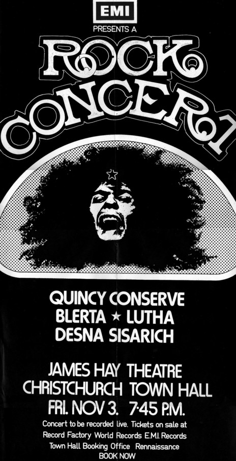
Live – Quincy Conserve, Lutha, Blerta, Desna Sisarich (HMV, 1973)
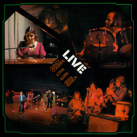
Judging by the poster that originally accompanied this 1973 LP (bearing a frizzy-haired-freak image that’s the spitting image of Marc Bolan?) the concert at which it was recorded was cooked up by EMI NZ as a device to bring together a trio of their long-haired, denim-clad rock bands with the introspective singer/songwriter stylings of the mysterious Desna Sisarich.
Desna shares the top half of the cover – the half that gets the eye contact during record shop flicking – with Bruno Lawrence in full monkey-man mode. It’s a beauty and the beast affair as the simian Lawrence gazes in Kong-like wistfulness at the prim Sisarich through the prism of her polished grand piano. Relegated down below are the dull, musicianly bods of Lutha and Quincy Conserve, lost in the red-gel miasma of Christchurch Town Hall’s lighting rig.
Design-wise the cover’s a four-square job, divided into quarters and framed by an old-timey photograph border. The title is rendered in a stencil font, signifying authenticity and the live, unmediated “event”. It’s probably the ultimate “rock” font as it makes explicit the connection between the electric guitar and amp arsenal of the concert tour with the weapons and hardware of the military tour. In this mythical telling a rock band’s concert itinerary becomes a “campaign”, the roadies are “grunts”, and there will assuredly be “casualties”.
Set at 45º in the diamond hub at the cover’s centre, the bands’ names are set in tightly kerned Memphis, a font made famous by the Merganthaler Linotype Company of Brooklyn, NY. The battered copy of their 1936 type catalogue that I’m looking at now informs me “… though based on a century old Egyptian design, Linotype Memphis is far removed from its crude ancestors”.
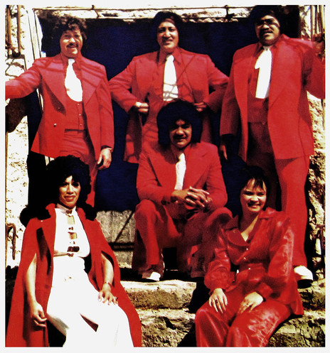
The Maori Volcanics Live! (Revolution, 1975)
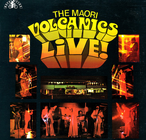
The low-slung concrete façade of Johnsonville’s Broderick Inn – as pictured on the cover of this half live/half studio LP – wouldn’t have looked out of place in Stanley Kubrick’s 1971 ode to ultraviolence, A Clockwork Orange. During the 1970s the Brod was a favourite venue on the breweries circuit for covers bands, though by the early 80s more original post-punk acts provided some droog action. As featured here, in 1975, it was hosting a somewhat more benign gang known as the Maori Volcanics.
With a cover designed by producer Bobbie Davies and guitarist Billy Taitako – soon to become Billy T James – The Maori Volcanics Live! lays its 70s soul bare in a perfect symmetry of massive lapels, flapping flares and big, big hair. The uncredited photographer (probably staging the shoot pre-gig – there’s no sign of any audience) puts a star filter over the lens for a glittery Vegas vibe and the photo gallery is crowned by a hand-lettered title logo adorned with koru serifs and a workmanlike application of Letratone, an adhesive dot-screen product from the Letraset company.
Redolent of chicken-in-a-basket cabaret suppers and gas-guzzling Holdens – driven half-cut, no seat-belts – The Maori Volcanics Live! is as real a snapshot of 20th century New Zealand as the Hi Diddle Griddle image above. But somehow I’m not as keen to time-travel back to the Brod – I would never be able to carry off a jacket with lapels like that.
--
Read Sound and Vision: Album Design part 1 - here
Read Sound and Vision: Album Design part 2 - here
--
Chris Mousdale is a native of Liverpool, England, living in New Zealand since 1990 where he works as an illustrator, designer and artist. He’s taught Illustration and design at Auckland University of Technology and has held numerous solo exhibitions of his paintings and constructions. In 2003 he won the New Zealand Post Children’s Book Award for Brodie with Joy Cowley. Always active in the music/art industry, Chris served as curator for exhibitions of Brazilian bossa nova LP designs (2000) and co-curated the British Council Sound Design exhibition of New Zealand record covers (2002). His recent design work includes a series of covers for Blue Note Records in association with Music Matters Ltd. This article is the third of a series for AudioCulture.