In New Zealand, even more than most places, the identity of a scene lies not only in the music, but in the visual art created around it. Posters, videos, sleeves and photography will often come from the crowd around the band, or from the musicians themselves.
This week the local record industry celebrates a two-year programme of digital re-releases that has brought back more than 200 local albums, some of them unavailable for decades. In what will be an occasional series on AudioCulture, we've had a look at the art of some of those albums – and the stories behind the images.
Vehicle, The Clean
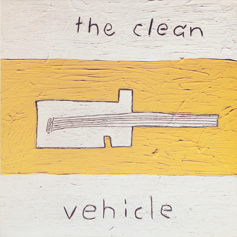
There are album covers and there are classic album covers, and the cover of The Clean's Vehicle is very much the latter, not least because it features on the best Flying Nun T-shirt ever. Vehicle was a "reunion" album recorded at the initiative of Geoff Travis, the founder of Rough Trade, which distributed the Flying Nun label in Britain. Travis pointed out that the album would need a sleeve image. The Kilgour brothers, Hamish and David, have created much of the band's artwork over the years (the third member, Robert Scott also draws, but his work is generally for his other group, The Bats) and in this case the job fell to David, who painted a small, highly textured image of a guitar in acrylic on canvas.
"It has no meaning," insists David. "Well, it's a guitar and an odd guitar and we play guitars and I love Bo Diddley, so that's a reference. But also the guitar was and is a vehicle of discovery, a creative vehicle and it can take you away to many places and many adventures. I was certainly aware of that when putting it all together.
"With The Clean's art and to a lesser extent my own music-associated art, I figured the odder and more minimal we made it the more it would stand out and be easy to use as a tag, an advertising hook.
"I have always been attracted to less-is-more. Hamish and I always had a pretty defined idea of how we wanted to project ourselves when coming to being in The Clean. It may look like naive art made by naive people, but it's naive art made by some lads who knew what they were up to."
It’s become an iconic sleeve — did he know it was a goodie straight away?
"We wouldn't have used it if we didn't dig it, but no one predicts the future about these types of things. You've gotta remember, there were sceptics out there about us reforming and making new music. But some of these songs have become what some call Clean classics. Who would've thought? I don't think we did when were making Vehicle. It's a funny old world, ain’t it?"
Let Sleeping Dogs Lie, Ticket
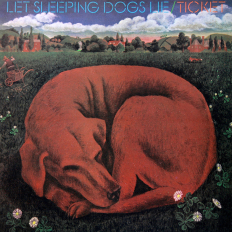
When Ticket needed a sleeve illustration for their 1972 album Let Sleeping Dogs Lie, they turned to a young artist who was starting to make a name for himself. It was a name that would become very well-known in years to come, but fans of his work now might be hard-pressed now to pick the singular red dog as … a Dick Frizzell!
"I was excited to be asked to do it!" Frizzell recalls. "I was very involved with the music scene back then – with Hotlicks magazine and Roger Jarrett and I was doing a lot of rock and roll illustration. The Great Ngaruawahia Music festival poster and so on. I had also just done the first Dragon cover. I was fascinated by all those exotic, long haired, velvet-jacketed creatures. Doing the art for these guys was almost like being in the band for a minute."
And the style?
"Round about then, I was trying to find my way back into the art racket with what I thought were subversive John Kinder-ish watercolour landscapes, from the rolling hills of Pukekohe. And I thought it would be interesting to try and link my art explorations more directly to a commercial application. I was also looking at an American illustrator called Paul Davis who was trying to resurrect the craft of the painted poster.
"On reflection I wish I'd hit it a bit harder, made the rendering a bit more punchy. That Red Dog cover is a bit more recessive than the Ticket music on the inside! Got a bit too 'arty', maybe."
Ticket's bass player Paul Woolright has no such reservations.
"It was Dick's concept, Dick's artwork, and I think even those few people that have a copy of the original vinyl are unaware of what they have in respect of the music and the quality of the artwork. Unfortunately time has blurred most memories of those great times."
But the lucky few who own the original vinyl still have something all to themselves. The digital re-release includes the front cover illustration. But there was a back cover too, drawing from the same theme.
Melt, Straitjacket Fits
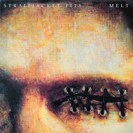
Straitjacket Fits drummer John Collie is an accomplished artist across a range of media and was responsible for much of the band's visual art, but the cover of Melt stands out, not least because it's such a visceral, unnerving image.
Collie says the image was converted from a painting he'd been working on at the time.
"I was into automatic drawing and I did this wee sketch in my book one day when I was thinking about men who are sexual abusers and who walk around amongst us like everyone else – they are anonymous but they know what they’ve done. I saw them as being kind of muted and deaf and blind, hence the stitched-up sensory organs. The painting originally had simplified female human body form sticking out of it – that was the memory.
"When I thought about using it for the cover of Melt it was the wrong shape, so I went about cutting it out and removing the body form. I really regretted this at first and thought I’d wrecked it! It has thick glazes and varnish, which started to crack. I finally, after hitting my head against the floor in frustration, got it stuck down to a board and finished it off. I put eyelets in the canvas and used linen thread to 'sew' them shut with suture-type stitching."
Did anyone have qualms about such a confronting image?
"Yeah there were some issues from the record company who thought it was too heavy. That’s why it ended up being cropped on the cover with the full image being used on the inner sleeve on the vinyl, and as a fold-up in the CD booklet."
Collie had the idea of doing a matching "melted" version of the image for the back cover, which came to fruition when he and bassist David Wood were "bored out of their brains" in an apartment in Melbourne.
"We had been getting a bit wasted. We decided that it would be a good idea to melt the eyelets into the waxy surface of the painting. So we did that by heating them red hot on the gas stove and then smashing them with a kitchen pot! They were then stuck into the painting."
Salty, The Mutton Birds
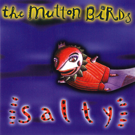
Mutton Birds founder Don McGlashan says the odd image came about through the band's relationship with artist and production designer Tracey Collins, who had created the cover for 'The Heater' single and also made the band a big "Heater" stage prop.
"I seem to remember Tracey got too busy to do the album cover for us, and suggested we talk to her friend Jenny Dolezel, who was another artist whose work we really loved. We ended up looking through existing paintings with her, and fixing on this image, which I think is a detail from a bigger painting.
"What does it all mean, man? I don't know! Except that we'd already decided the record was going to be called Salty, and Jenny's weird, floating being seemed like a sea-going image, with a kind of wonky joyousness about it.
Coconut Rough, Coconut Rough
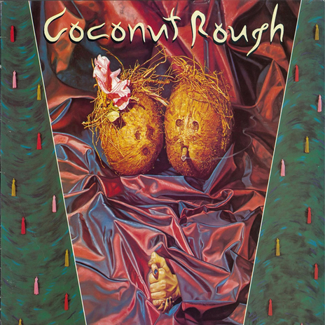
The striking hyper-realist cover of Coconut Rough's first and last album is the work of legendary musician and artist Phil Judd.
"He based it on a track from the album called 'Two Can Tango'," says former Coconut Rough singer Andrew McLennan. "I gave him no brief, just said 'paint me a cover will ya mate'. I loved the job he did. I wish I could say the same about the album but let's not go there."
Somebody Ate My Planet, Able Tasmans
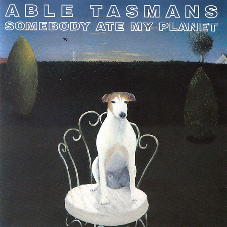
Able Tasmans originally wanted to use a photographic work by artist Craig MacDonald (who had a studio in the same building as their Galatos Street practice room) on the cover of their second album, Hey Spinner.
"But it included an image of Mickey Mouse and we were told by Flying Nun, in no uncertain terms, it would not pass muster," recalls bandleader Graeme Humphreys. "Chris Knox had already pissed off Mark E. Smith on a copyright issue and Roger Shepherd didn't feel like taking on The Disney Corporation.
"But we greatly admired Craig and for the next album, in order to get a Craig MacDonald piece for the cover we just asked him to do something – anything – and we'd use it. He painted a fucking dog with its penis waving at us. We were happy though."
McDonald these days works mostly in sculpture in Australia and had an exhibition last year in Auckland.
"He remains one of my favourite artists ever," says Humphreys.
Stunt Clown, Headless Chickens
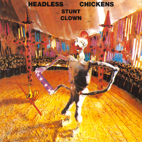
The cover for Stunt Clown is a rare instance of model-making in album covers. The model was made from painted clay and wood by Jacqueline Dwyer, who played a huge role in defining in the Headless Chickens' visual image. (She was also responsible for the woodcut cover artwork for the first Headless Chickens mini-album, the photogram cover art for the 'Donka'/'Soul Catcher' 7", all the live stage sets for the band's gigs from 1985 until 1991 and the giant Celtic backdrop for the original 'Cruise Control' video.)
"The idea for the album cover was mine, though," says the band's former singer Chris Matthews. "I'd seen a poster on a wall on K' Road advertising a circus which featured 'stunt clowns' and I thought it was a brilliant image to work with. I told Jac what I had in mind and let her interpret it as she saw fit. I had complete faith in her ability to come up with something great. The cover photo was taken by a friend who specialised in photography of dioramas and architectural models. I seem to remember it took a lot of fiddling around with to get it to hold together properly for the cover photo."
How does it relate to the music?
"Well, you know, running round like Headless Chickens and Stunt Clowns … It all made sense at the time. Actually, there was a song called 'Stunt Clown' that we were playing as part of our set right up until we recorded the album, but for some reason we decided not to record the album's title track. It was a good song, I've got some live recordings of it.
"I wrote it about Joseph Beuys, the German Fluxus artist who was famous for his obtuse and enigmatic performance/installation pieces in the 60s and 70s that involved pieces of felt and lumps of fat and conversations with dead rabbits and suchlike. It wasn't a very kind song about him, I'm afraid. I didn't fully appreciate what he was doing in those days.
"It's probably stuff like that that got us a reputation as being an 'art rock' band, although none of the Headless Chickens ever went to art school or music school, I think Michael Lawry was the only person in the band who'd even been to university and he studied Sociology. Not very rock and roll. Funnily enough, it wasn't until I very recently got my Bachelor of Visual Arts degree from Dunedin School of Art that I gained a greater appreciation of Beuys' work, so you'd think I might have figured out what a stunt clown actually was by now."